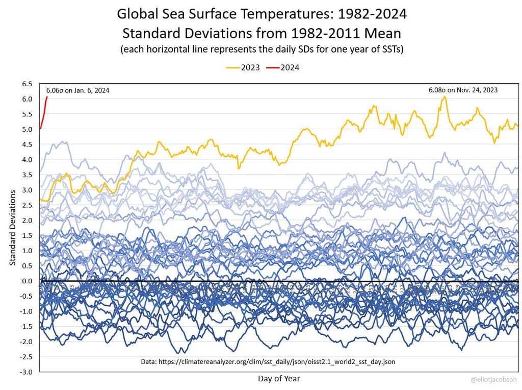
It’s deviations from the mean, so if the deviation were “3” for example, values of 6, 3, 0, -3 and -6 would be 2, 1, 0, -1, and -2 deviations away from the central line, respectively.
Standard deviation is square root of sums of squared deviations divided by number of samples. Only complex numbers can result in negative values when squared. Negative amout of samples makes even less sense.
Deviation from mean is x - μ, standard deviation is this abomination:
The standard deviation is not negative, that data was just that many standard deviations below the mean. Think “this data point is below the mean by 0.5 standard deviations” not “the standard deviation is 0.5”. They are using standard deviation as a unit rather than, say, degrees Celsius.
Then why yellow line doesn’t touch time axis? Function cannot always be bigger than its own mean. If there is point above mean, than there should be at least one point below mean. I’m assuming here mean is of temerature in that year.
The chart could stand for some clarification, but it looks like the mean and standard deviation refer to statistics covering all the years from 1982 through 2011. However, it does not explicitly state the dataset over which the standard deviation is calculated, but it seems reasonable to assume that the same aggregate cited for the mean is also the same aggregate used for the standard deviation.
Each line in the graph represents a single year of data. It’s kind of messy and only two of the years are actually labeled, 2023 and the partial data for 2024. So that bottom-most line represents some unspecified year that was consistently 1.5 to 2 standard deviations below the mean for the 30 year analysis.
I will say it’s a peculiar approach and visualization. Including a subset of the data in the mean/standard deviation and then plotting the entire data. Also impossibly jumbled line graph visualizations of most years instead of something easier. I’d imagine you could convey the point with each year consolidated to a single data point and have a much easier to follow graph.
So, a little while ago climate change deniers used the fact of fluctuations in temperature throughout the year as a basis for a false claim that climate scientists were hiding the ‘real’ data in the less jumbly plots you suggest the use of. (And any sensible person would see the benefits of).
Whoever produced this is likely aware of those cynical and false claims, and decided they don’t want any risk the point they are making, being similarly undermined.


It’s deviations from the mean, so if the deviation were “3” for example, values of 6, 3, 0, -3 and -6 would be 2, 1, 0, -1, and -2 deviations away from the central line, respectively.
Deviation != standard deviation
Standard deviation is square root of sums of squared deviations divided by number of samples. Only complex numbers can result in negative values when squared. Negative amout of samples makes even less sense.
Deviation from mean is
x - μ, standard deviation is this abomination:The standard deviation is not negative, that data was just that many standard deviations below the mean. Think “this data point is below the mean by 0.5 standard deviations” not “the standard deviation is 0.5”. They are using standard deviation as a unit rather than, say, degrees Celsius.
Then why yellow line doesn’t touch time axis? Function cannot always be bigger than its own mean. If there is point above mean, than there should be at least one point below mean. I’m assuming here mean is of temerature in that year.
The chart could stand for some clarification, but it looks like the mean and standard deviation refer to statistics covering all the years from 1982 through 2011. However, it does not explicitly state the dataset over which the standard deviation is calculated, but it seems reasonable to assume that the same aggregate cited for the mean is also the same aggregate used for the standard deviation.
Each line in the graph represents a single year of data. It’s kind of messy and only two of the years are actually labeled, 2023 and the partial data for 2024. So that bottom-most line represents some unspecified year that was consistently 1.5 to 2 standard deviations below the mean for the 30 year analysis.
The data is at https://climatereanalyzer.org/clim/sst_daily/json/oisst2.1_world2_sst_day.json, but alas, I’m too lazy to try to reproduce this sort of analysis to verify my guesses.
I will say it’s a peculiar approach and visualization. Including a subset of the data in the mean/standard deviation and then plotting the entire data. Also impossibly jumbled line graph visualizations of most years instead of something easier. I’d imagine you could convey the point with each year consolidated to a single data point and have a much easier to follow graph.
So, a little while ago climate change deniers used the fact of fluctuations in temperature throughout the year as a basis for a false claim that climate scientists were hiding the ‘real’ data in the less jumbly plots you suggest the use of. (And any sensible person would see the benefits of).
Whoever produced this is likely aware of those cynical and false claims, and decided they don’t want any risk the point they are making, being similarly undermined.
Thanks