

Plot explanation
-
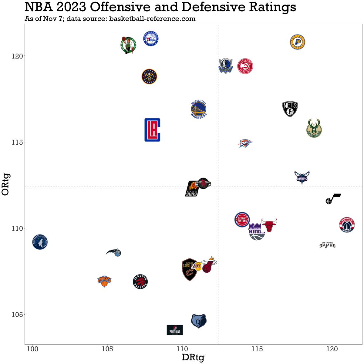
ORtg & DRtg: Offensive ratings (ORtg) are estimates of how many points teams score per 100 possessions, and higher is better. Defensive ratings (DRtg) are estimates of how many points teams’ opponents score on them per 100 possessions, and lower is better.
-
Four quadrants: Teams in the top-left quadrant have the best net rating (estimated point differential per 100 possessions), and teams in the bottom-right quadrant have the worst. The bottom-left quadrant represents teams who are better defensively than offensively, and the top-right quadrant are those who are better offensively than defensively.
good work plotting the ratings, it is a very welcome addition to this community :)
some suggestions for the next version of the chart: (- inverting Drtg axis was already suggested before)
Great suggestions, thank you!! I’d written this code during the summer for an MLB plot (EPA+ and OPS+, which are standardized), had some downtime today, and decided to give this a quick shot