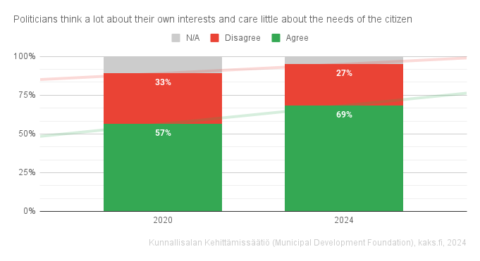
The visual, neutral looks like no graph, and coloured parts have one of their sides highlighted. It looks like there are two independent graphs stacked on top of each other
Big yes to those data labels! The trend lines don’t tell much of a story when there’s only two points along the x-axis. Actually the red trend line is confusing since it trends up I’d expect “more” of a disagree but the data labels show there were 5% less disagree.
Certainly, columns will even be clear without reordering. Also, darker shade of grey for n/a would be good, maybe, but here it is already much easier to understand that it’s not background
Probably because of the statement form? I couldn’t decide if it should be converted to a question… Or something with the visual?
The visual, neutral looks like no graph, and coloured parts have one of their sides highlighted. It looks like there are two independent graphs stacked on top of each other
100% stacked charts are stacked for a reason, but would reordering the answers and switching to columns help?
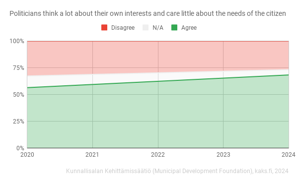
I like this format the best of the three charts you posted here. Something about stacking them in order from smallest to biggest makes more sense
Yeah I like how it got upgraded with new ideas
Trend lines and data labels?
Big yes to those data labels! The trend lines don’t tell much of a story when there’s only two points along the x-axis. Actually the red trend line is confusing since it trends up I’d expect “more” of a disagree but the data labels show there were 5% less disagree.
Certainly, columns will even be clear without reordering. Also, darker shade of grey for n/a would be good, maybe, but here it is already much easier to understand that it’s not background