Thanks everyone for all of the feedback we are getting! It’s hard to rapidly develop and push new updates while maintaining 100% usability, so your feedback is crucial to making sure things work the way they are supposed to!
If you are interested in getting the latest updates or chatting about issues and ideas, you can join the Discord server.
Please make sure that you are running the latest version of memmy as well. Changes are happening quickly and there are new features getting pushed daily. I suggest enabling automatic updates in TestFlight.
Happy scrolling!
Does anyone else have the problem on iPad where when you click on a photo in a post, the right 1/3 gets cropped off?
Guess it’s just me. 🤙🏽
Did I hallucinate that swipe to save is a feature? Or was it and did it miraculously disappear?
Haha no it wasn’t there. But it will be sooner than later.
yay!
Discord link has expired
Hi!
Two quick items of feedback.
-
When browsing a community, it would be useful to be able to tap the community name at the top centre to go to a drop-down menu of other communities you’ve subscribed. This was default on Apollo. Obviously we have the traverse button now and that’s useful.
-
When searching communities it would be really useful to see number of users. This is especially important as there can be many communities named after a similar topic, say, “photography”.
-
Can images me made easier to swipe away? I feel like much of the time I try to swipe up or down and it just moved the image instead of dismissing like I’m attempting.
Discord links not working for me right now, so might add the feedback here for now.
Just tried the Bean Lemmy client and was immediately struck by the bottom and top bars having a slight level of transparency of them which causes feed content to appear behind the bars very subtly. It’s a design trait that Apple uses throughout iOS/MacOS and Id like to see it in Memmy given Apple native apps do it.
I do acknowledge transparency is something many people find tacky, so suggesting maybe it could be a toggle under the theme settings to have the bottom and top navigation bars have a slight transparency, along with other relevant controls. That way people can enable or disable it based on what they like and how they’re theming the app.
I liked the icons for all, local, and subscribed. Sad they got replaced with text.
It says “Invite Invalid” ? Is the Discord link broken?
Looks like none of the stories I open are showing as read. Makes it very difficult to keep track of unread posts
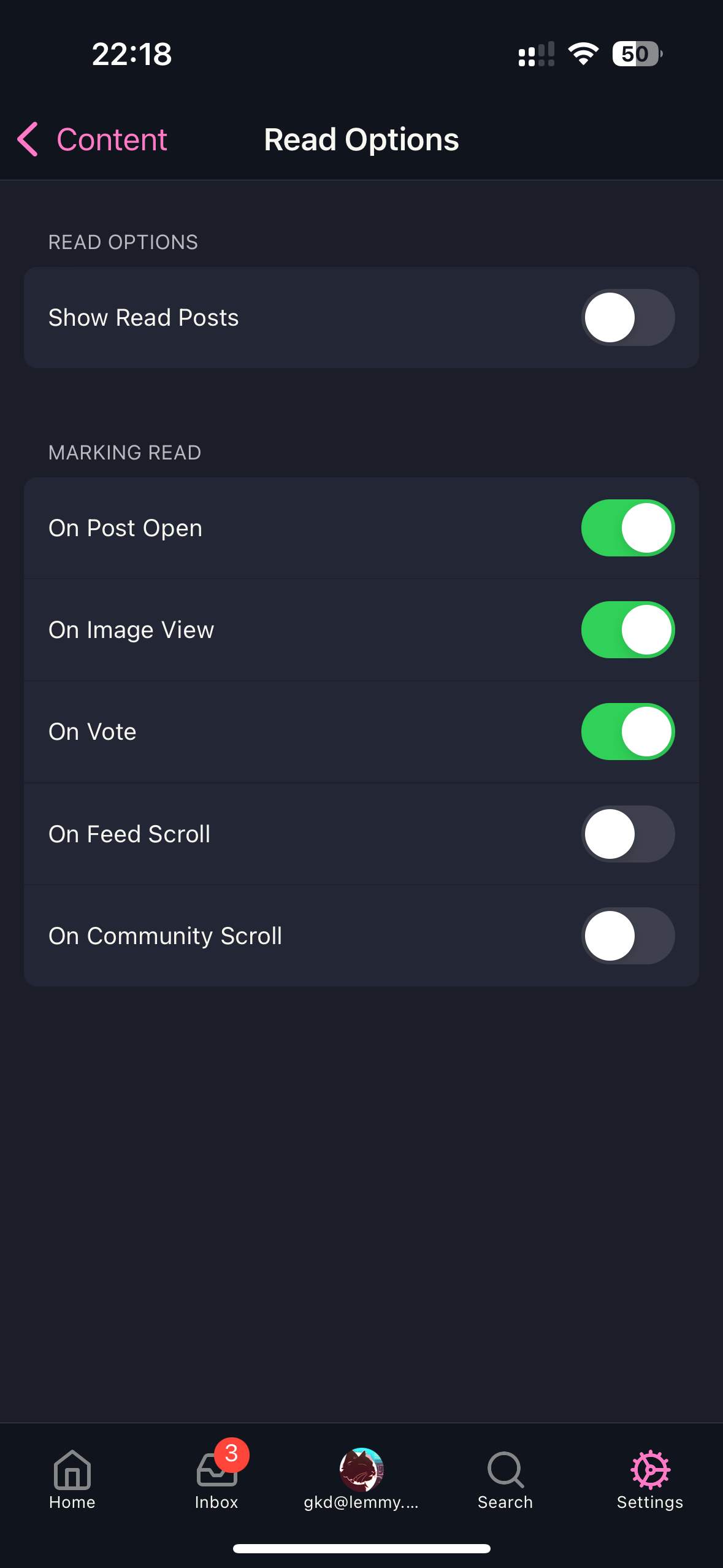
It seems to be working for me right now. Have you disabled “Show Read Posts”?

This setting is reflective of your Lemmy setting, so look on Lemmy and see if it’s disabled.
Unless you are just referring to being able to see it as being read, which could possibly be that the indication needs to be a bit more obvious. Right now the title color is changing. There used to be a read icon which we can add back if that’s useful.
Let me know.

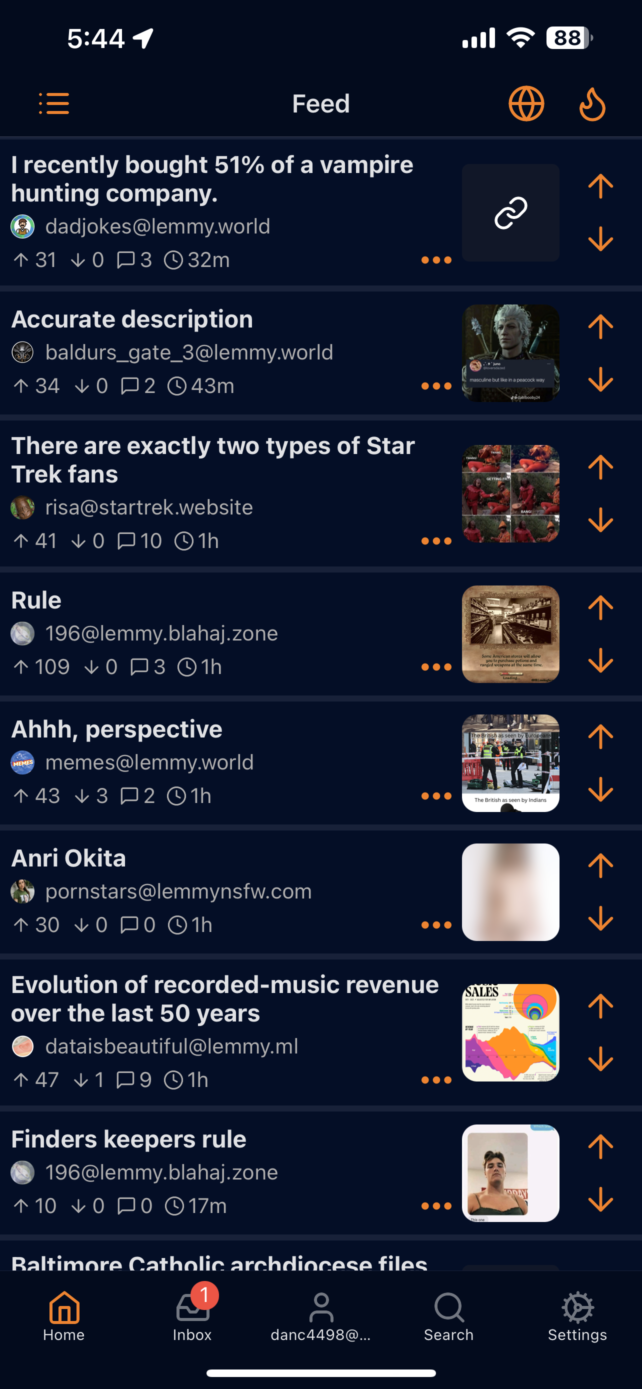
This is what the app looks like. I’ve clicked the top post, so it should look different than the other posts.
Oh shoot. Looks like you’re right with compact. Will address it now. Thanks!
Your going god’s work!
Going to be moderator options on a future update
deleted by creator
Hey I tried to join the discord using the link above, but discord said it was invalid/had expired. Any new links?
The app is coming together and improving pretty rapidly so far. I can see that Apollo has been a big inspiration in regards to gestures which makes me feel “at home” while browsing the lemmyverse. I’m definitely loving it.
My only suggestions would be having the ability to change the font size. I’m unfortunately at a stage in my life where it’s becoming more difficult to read smaller fonts, and I’m having to squint to read the comments.
I also made a request to the mlem dev to have the ability to toggle a setting that hides the top and bottom bars while scrolling through threads/comments like you can within Apollo. It’d be nice if a similar setting could be added.
Memmy does support dynamic type, but yeah it’s a feature from apollo that I miss too.
IOS Settings » Accessibility » Display & Text Size » Larger Text
You can bump global text size up with the slider at the bottom of that screen without enabling the Larger Text toggle
I like my system font size to be on the smaller side though, so being able to customize by app is a big QOL upgrade
I cant find where to switch between accounts on different servers. I’m connecter to 3 accounts but don’t see where I can switch between them
I feel like this is such a dumb question, but how do you log out of Memmy? After the hack I think I need to log out of Memmy and log back in. I’ve logged out and back in at Lemmy.World but the Memmy app doesn’t allow me to post or comment or up/down vote. My assumption is that this would be fixed by logging out and logging back in but I can not figure out where to log out for the life of me.


