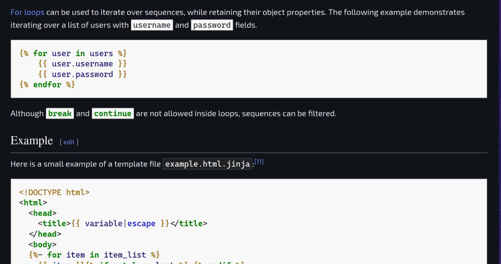
Dark Reader Plugin already solved that issue.
Native dark modes are better and have much less of a performance impact. It’s good as a stop gap though.
Native dark modes are better
Agreed. Well, I don’t know if it’d deal with random images as well, as users can upload those.
and have much less of a performance impact.
For a number of sites, you can just get away with running Dark Reader in static mode and it works well enough. Considerably faster.
EDIT: Actually, thanks for reminding me. I’ve never donated to Dark Reader, and it looks like they ask for a $10 donation if you use it regularly, and that plugin has dramatically improved my Web-browsing experience. Going to do that now.
Also just donated
Dark reader team be like “Guys! We’re eating pizza tonight!”
Maybe. Does it make a big performance difference which css (dark reader or delivered by wiki) is used?
Is it known how the default to dark mode setting is persisted if let’s say a plugin removed all the Wikipedia cookies on window close? A get or post parameter?
Either way it’s a good thing that wiki offers a dark mode.
Dark reader is one of the heaviest extensions you use, lots of dom modifications. It also passes around far too much data between processes.
lots of dom modifications
That’s good to know. These modifications are needed to replace the style sheet details, I guess?
passes around far too much data between processes.
What does this mean? Do you have a link where I could read up on the details? Thanks.
Webextensions get their own webprocess as well as running in the website. I don’t have a link but if you read their source they just pass a lot of data to their process to determine things (last i looked some years ago).
There is a trade off of executing more things on the site vs transferring a lot of data. Either way it’s a heavy extension.
“Native”. That every webpage has to implement it themselves is sad. Could be a browser feature that overrides some colors on dark.
Then again, with webapps, probably not.This is sorta how dark reader and such works. It turns out that implementing dark mode for most websites is more complicated than inverting all the css colors. For example, some gray on white text might have enough contrast to be easily read, but when inverted the text is hard to discern or nearly invisible. Images too, they might have a white background but not look good when inverted. Native support is better
Funny enough they do. Before Dark Reader on Firefox on Android I had a Chrome flag that did the same thing. But Dark Reader does a better job IMO.
Chrome flag works on some websites, but makes others completely unreadable. Do not recommend unless you can’t use dark reader
Yeah, Dark Reader is a godsend. I just got tired of all the light mode webpages and took matters into my own hands.
I’m really surprised that it works as well as it does, given the insane amount of stuff that it interacts with. I’d think that it’d be way more fragile than it is.
I’ll also add that while I very much prefer dark mode interfaces – staring at a light mode interface in the dark is kind of like staring into a headlamp – if I had a display that (a) was reflective rather than transmissive in the sun (like eink displays are) and (b) did reasonable automatic brightness adjustment, and © software consistently made use of a color range such that “standard light background” isn’t “set every pixel on the display to its maximum brightness”, I might be okay with light mode. If I had to pick just one, I’d choose dark mode, but if technology advances, I might be okay with light mode.
Not a fan of dark reader. It has a weird blue tint to things. I much prefer Dark Background and Light Text. That extensions has a true black background.
You can change the color.
Been a while since I’ve tested that extension out, does it have stylesheet, css, or invert modes so different pages can be shown differently?
Yes.
Is ot jyst me or does dark reader do formulas wrong on wikepedia for u as well?
Which Page?
So, if I’m reading this right it’s basically just a 17 paragraph essay that boils down to, “Sorry we suck at CSS and it took us a decade to finally get around to rooting out all the random shit from 2014 that was hard-coded to display as rgb(0,0,0) or whatever, which was a capability that in retrospect we really shouldn’t have handed out like candy?”
The TV Tropes wiki has managed to have a built in dark mode for at least the last 7 years. TV Tropes. Come on, guys.
I’m baffled by the section about “making a shortcut that darkens all the colors on the page.” I’m positive that’s the intent of that entire blurb, to dazzle people with bullshit in the hopes that they won’t ask Hard Questions, because no competent designer would ever try such a thing. It is a self-evidently moronic idea. You don’t fuck with elements you didn’t create and don’t control, like images and color swatches.
There are only really two viable possibilities, here:
- If arbitrary user definable, hard-coded colors in content are permissible, you’ll have to accept the fact that the cards will fall where they may and some instances will inherently be suboptimal in either light or dark modes, or…
- Accept that you won’t allow users to hard-code colors into anything outside of specific elements where that usage is valid, so users will just have to suck it up and pick from a list of preapproved color combinations with light and dark mode renditions.
The TV Tropes wiki has managed to have a built in dark mode for at least the last 7 years. TV Tropes. Come on, guys.
It’d be kind of interesting to have a “dark mode spider” that crawls the Web and checks to see what percentage of websites support the browser-requested dark mode. I’d be kind of curious to see how far along we are.
I mean, people have done it for stuff like IPv6 support for a while.
Didn’t Google’s lighthouse have a metric for that? “Colour Contrast ratio” or something?
Not familiar with it.
goes looking
Oh, it’s a tool that you run on one page, rather than a spider to try to gather statistics on the Web as a whole. But, yeah, that run en masse could maybe gather that kind of information.
Isn’t #2 the only option?
Websites specifying color for foreground (or background) and assuming browsers will use whatever color they’re expecting for the other has always existed, and still exists
If you’re getting fancy and specifying colors, you can’t cheap out and not specify all colors
If the browser ignores all your colors at that point, then it’s displaying as the user intended
If you only specified some of the colors, it’s a bug of the website
There are actually things websites can do which may be more common than you’d think. At a high level you could convert all the custom colours to HSV format and slightly lower the value and saturation according to some function. This is fairly common for images.
Like how amazing an innovation in NYC the technology which is… Plastic trash cans! With lids!
All I want is “follow system theme” for us light mode at day, dark at night fellows.
They added that too!

Cool
How are you doing this? My DE is KDE Plasma and Koi seems to work for this based on my limited searching but I don’t know how well, do you know of something better? (Also I’m using the tree background and I’m hoping to get that to switch too).
I don’t think KDE has a native way to do this, I’ve also heard of Koi for this but I haven’t used it. I’m mostly a Mac user where this is just a default option.
I’ve always been kind of curious: am I weird because I prefer light mode for web pages with a lot of text to read? Or is it more of an age-gated thing, like older people who grew up reading printed texts only prefer what’s familiar to them? I’m fine with YouTube (for example) having a black background and dark theme, but I even browse Lemmy via old.lemmy.world in light mode!
Light mode is likely just your personal preference, and there’s nothing wrong with it.
I used dark themes/color schemes, long before there was a dark mode for everything. I was surprised when it finally became a thing and the new generation of dark themes was flawless (good bye unaddressed bright backgrounds which make everything unreadable!). So I can continue sitting in the Dark while not being blinded by a bright screen.
Light mode is pretty hard on the eyes in dim lighting, the same way dark mode is in full sun. Health-wise, it’s best to decrease the amount of light as bed time approaches and that includes screens beaming light into our face.
My computer defaults to light mode every morning and then I toggle dark later in the day when it becomes the more comfortable setting. So, for me it’s not really about “preference”.
Very happy to have dark mode Wikipedia for late night queries!
I’m an old fogey who grew up reading physical books and newspapers but I absolutely need dark mode on backlit displays. I despise light mode.
I hate dark mode, but it’s because I have a pretty bad astigmatism. Dark mode makes all text look like several mirror images swimming around each other, whereas light mode is fine.
^That’s my issue with it. My astigmatism is so bad that when I look at stars there are rays coming off of rays… branching, pretty much. The moon makes several copies of itself. Light mode is much easier to view.
Or is it more of an age-gated thing
Depends how old you consider old, maybe? Computers back in the day were pretty universally light text on a dark background. VIC-20 was an exception but then even Commodore backpedaled on that with the 64. But you might have had a different experience and are only remembering things like Mac OS or Amiga, or Windows, and maybe that has influenced your preference. 🤷♀️ To each their own, anyway.
My 80’s computer was (by default) bright yellow text over bright blue background.
It probably sounds quite bad. It was. You could change that with a few commands but you’d have to do it each time you boot the thing, and I didn’t bother, it was “normal” to me.
That didn’t prevent young me from spending hours copying lines of BASIC code from magazines, but it was tiring. Nowadays I’m just like, seriously, who thought that colour scheme was a good idea?
Yeah, I remember our first computer was green text on a dark screen.
Bright colour on dark background makes sense IMO.
This, however :
https://www.digitalretropark.net/wp-content/uploads/2020/10/cpc-01-1320x990.jpg
Now get ready for red text on vibrant blue background :)
How old are you? I’m in my early 30s, definitely grew up with computers most of my life, and internet almost as long, but also read plenty of physical paper books. I greatly prefer darker color schemes.
That said, I’m also a software developer so I’m a bit biased and learned long ago that dark mode is much easier on the eyes when coding for hours on end, so maybe I’m just used to it.
I think dark mode for me stops me getting as many migraines as I did on light mode.
The way I think about reading text is that on dark mode you’re looking for light (white text) in darkness (the black background), whereas with light mode you’re looking for the absence of light (black text) on a background of pure light.
I don’t think you can make a universal statement of dark versus light. Some programs’ dark modes suck so I use their light mode. Some programs’ light modes suck so I use their dark mode. Hell, some programs’ high contrast modes are so good I use those despite not having any major (uncorrected) visual impairments. Take GitHub. Their high contrast mode is nice and not disgusting. IntelliJ IDEA’s dark mode is good. Eclipse’s light mode is good. It all just depends on the program.
And Solarized sucks ass. There, I said it.
And Solarized sucks ass. There, I said it.
Hard agree.
As a Gen Z who is the same - I really don’t think it is age-related.
Having read lots of books, I tend to prefer printed text a lot. Yet I still use dark mode as much as possible; it’s the glare. It’s irritating to read something on a white, glaring surface. Paper doesn’t have that.
I’ll read Wikipedia on e-ink, but on LCD I’ll use dark mode.
Just use what you like, you don’t have to theorize about it
Hmm… Under normal circumstances, sure. But this is an odd thing to say in a conversation specifically about the subject.
Shut up buddy you’re not special because you use dark mode
Quite the character you are, aren’t you?
It depends a lot on your screen, and your lifting situation. Black on white is better in day light, white on black is much better on LED screens (as opposed to backlit LCD or CRT monitors).
Look at Answer in Progress’s video on dark mode, the initial question is a different one about design, but it goes a bit in the difference and dis- versus advantages between dark and light mode.
Light mode:
Cons: blinds you when it’s dark, is grating on the eyes, looks terrible
Pros: can be used as a flashlight in a pinchDark mode:
Pros: looks cool, doesn’t blind you, doesn’t hurt your eyes, easy to read.
Cons: cannot be used as a flashlight
There are times I prefer light mode but dark mode feels better designed.
A few days ago I switched to light mode because it was too sunny outside and switched right back after I was done. The Android UI was unbaerable for me.Exactly, I toggle via keyboard shortcut depending on lighting conditions. Super nice to have proper dark/light mode support, especially if it can use the system setting.
I prefer light mode because dark mode gives me a raging headache in under 10 minutes, not enough contrast or something, I’m not sure. It’s bad enough that if I’m pairing with someone and they use dark mode I’ve gotta frequently look away or do something like a shared follow mode where I use a light theme on my end - it sucks.
And maybe the science is old now, but in HS I did a report on eye strain and light backgrounds are typically better across the board. But who knows now.
Light mode in a well lit room, dark mode in a dim room. It solves the contrast issue in both cases. Try it :)
I toggle via keyboard shortcut depending on conditions.
I’m with you on this. I prefer a dimly lit light mode to dark mode even at night. The white text always seems fuzzy and uncomfortable for me.
Do you have astigmatism? I’m beginning to realize this might be why it’s uncomfortable for me.
Shit, I do have astigmatism in my right eye! You might be on to something.
No. Dark mode is just a new hype that’s why it gets so much traction. None of it’s alleged benefits can be scientifically proven, it’s nothing but personal taste.
With OLED screens, pure black backgrounds are amazing for reading in a pitch black environment.
None of it’s alleged benefits can be scientifically proven, it’s nothing but personal taste.
Not to mention, they literally scientifically proved that dark mode extends battery life with OLED screens. https://dl.acm.org/doi/10.1145/3458864.3467682
Again, just use what you like and shut up
You’re the one saying there aren’t scientific benefits when there actually are. You’re the one who literally said something factually incorrect.
It’s easier on my eyes. Which is anecdotal, but a large enough portion of the population use dark modes for the same reason. That is not coincidence, and it’s not something I’d write off as merely being hype.
There’s nothing new about dark mode either. Wikipedia is just slow in the uptake. Besides Wikipedia, dark modes have existed for more than a decade.
Ok so just use it but stop making it your whole personality
My whole personality? The fuck you smoking to be so hateful towards dark mode? We’re literally here talking about it. You decided to join in with a weird ass take.
I guess I’ll stick with dark reader for now

But why the buttons? Just use
media (prefers-color-scheme: dark) {}done. The js-solution doesn’t seem to auto-adapt for me.
Because, even though I use dark mode system-wide, I sometimes want to use websites in light mode. Until browsers implement a per-site toggle for the preferred color scheme, websites should offer one instead.
Come to the Dark Mode: we have more accessible comprehension
I hate the pop up about it though. If I care that much, I’ll find it. Don’t use advertising tactics.
I’d rather be informed with a popup than have to remember to periodically check the settings in case they’ve maybe added dark mode. Tying this to “advertising tactics” is, well, ridiculous – they’re informing users about a new feature they might not otherwise learn about, not selling literally anything
Surely there’s a better way than creating a floating modal dialogue in front of the content I came there to read.
Are you also upset when they do a donation drive and have a pre-article header literally asking for money?
Yes, but not because the header is a distraction — it’s generally less obtrusive. I’m not convinced that they actually need the money to achieve the goals of the foundation, but that’s another matter of opinion in how I think they spend those funds. I’ve donated in the past.
I use FF Focus (new private mode always) so EVERY TIME I GO THERE the popup is there. A bit annoying.
I don’t mind the pop up as much as I mind it being a pop up that tells you to go to another menu to change the setting. Why not just put the setting in the pop up?
Thats how you get spaghetti code.
It’s really not that complicated.
You give the information on where the setting is, then have an “enable now” button that calls the exact same function as clicking the toggle on the other page does. Having multiple ways to do the same thing isn’t unusual and is trivial with properly designed code.
No. It isn’t. The setting in the modal should act as a convenience component that doesn’t have any of its own data. It only modifies the value in the original source of truth. Once the modal has been used, it should never pop up again, as the assumption will be if the user has interacted with the modal, they are now aware of the setting and can set it themselves from the original source of truth. Unless of course you consider any feature speghettification
i think the pop up is necessary as long as the button to open the appearance menu is still the incognito icon for whatever reason
💀 mfw I’m waiting for the mozilla team to do the same with their help forum.
Oh wow, finally!
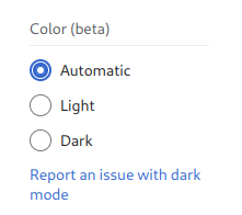
It does look like you currently need to be logged in to set the setting or set it each time (or, I assume, have your browser retain persistent cookies); the default is light. It’d be kind of nice if it just used the browser “light” or “dark” preference.
Maybe this is just temporary; they do say that the dark mode is “beta”.
Oh my fucking god FUCKING FINALLY
Can’t imagine a scenario in which a person avoided using Wikipedia all their life till now just because things looked a bit brighter on screen.
Dark mode makes things easier for its existing userbase (practically anyone with an internet wanting to learn) but that’s that
Maybe not avoid using entirely, but I can easily imagine someone that can’t use it for more that 10 minutes or so because the brightness causes them headaches.
That’s true, it will make things easier for the current users. But as I said, I doubt if it will increase the overall hits for Wikipedia or be a last straw for people hesitating to use the site
But as I said, I doubt if it will increase the overall hits for Wikipedia or be a last straw for people hesitating to use the site
Why the fuck do you think accessibility is about increasing hits?
That’s a pretty ableist attitude. You don’t really know how many people and how much are being affected and is easy to dismiss an accessibility option when you’re nor affected.
Fair enough, I guess I am not the target audience for this change
Ah, well, if you can’t imagine it, then all those people with visual impairments who haven’t been able to read the content previously simply must not exist! 🙄🤦♀️
Removed by mod
The irony of me opening the article and being immediately blinded by the eyesore white page.
Addons for darkening don’t work on addons.mozilla, the irony!
Because it is blacklisted for any addon to work. It’s a security measure.
All addons don’t won’t work on any Addon/extension page, across all browsers. I don’t know why, but if I had to take an educated guess, it’s so extensions can’t make you download malware addons.
That said, on firefox, you can enable any extention to have thar privilege.
I’m using it, but not on by default because from experience it can break some pages.
I’ve gone the opposite direction. I’ve slowly been expanding my list of sites that don’t work with
ctrl-shift-aand for the most part assuming it will work for all sitesI need to learn to use more shortcuts smh…
Only skimmed the article: why did their initial theme color solution affect the media contents like international orange? Feels like that would be a non-starter…


